Deprivation in England: What’s changed, and what’s stayed the same?

The Ministry of Housing, Communities & Local Government has updated the English indices of deprivation, providing a granular view of the geography of deprivation.
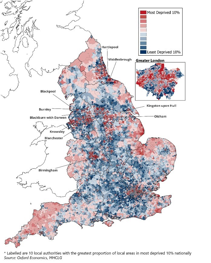
So, what does the latest update to the Index reveal? First, deprivation in England remains deeply entrenched, with the highest concentrations found in coastal communities and deindustrialised urban centres. The persistence of these patterns is evident, with many of the same areas repeatedly appearing at the top of the deprivation rankings across years and core metrics. This enduring inequality is perhaps unsurprising given that it reflects the self-reinforcing dynamics of poverty and serves as a stark reminder to policymakers of just how challenging it is to break cycles of economic and social disadvantage.
The most deprived local area continues to be in Tendring, on the coast of Essex, while Blackpool—another coastal town—dominates the most deprived neighbourhoods, taking seven of the top 10 spots. Other highly deprived areas include Middlesbrough, which has the greatest number of local areas in the most deprived decile (50%), as well as Birmingham, Blackburn, and Liverpool. And much of this persistence across areas is longstanding: for example, eight local areas in Liverpool have been in the most deprived 1% of deprivation across all six updates of the Index since it was first launched in 2000.
Chart 1: England’s most deprived areas are concentrated in major cities, post-industrial towns, and coastal areas
Unlock exclusive climate and business insights—sign up for our newsletter today
Second, the geography of deprivation reflects England’s longstanding North-South divide with economies in the North and Midlands the most deprived. Within this latest edition, roughly one in five local areas in the North East, North West, and Yorkshire & the Humber are in the most deprived decile, compared to less than 5% in London, the East of England, the South East, and the South West. Levelling up, as a political and economic fault line, does not appear to be going anywhere fast.
Finally, deprivation is hyperlocal and often co-exists alongside significant prosperity, a nuance that reflects the cheek by jowl nature of deprivation across England. London, for example, has a low proportion of local areas in the most deprived decile, but large swathes of neighbourhoods in the second- and third-most deprived deciles. In fact, outside of the North East, London has the highest proportion of local areas suffering from above-average levels of deprivation of any other region. While this is similar to findings in previous versions of the Indices, it is something that has become more pertinent in this latest edition due to the greater weight put on housing costs in the updated methodology.
What is different?
As noted, the increased weight on housing costs within the latest update has increased deprivation scores for those areas with the highest house prices. This clearly has had a large impact on London, which has been a poor performer in terms of access to housing across previous editions. But the main impact has been on London’s income deprivation rank, with housing costs now included to better account for disposable income. London’s rankings have deteriorated notably as a result, with the proportion of its local areas that are classified as being in the most deprived decile increasing considerably since 2019. London now makes up seven of the 20 local authorities with the largest number of people suffering from income deprivation—in 2019, it was three.
But any movement in the rankings must be treated with caution. As well as the changes to the income domain, there were several additions and modifications to the list of indicators to modernise and improve the Index. The Index was also updated to reflect new population estimates and geographic boundaries. And it is important to bear in mind that the Index measures relative, not absolute, levels of deprivation. So, it is possible for an area to become more deprived relative to the rest of England, despite suffering from less actual deprivation.
Why is this important?
The Index is valuable in providing an assessment of local need, and it is used for targeting policy, resources, and funding. Also, given that it looks at deprivation across seven different domains, it allows us to see which geographies suffer in particular areas, and which have more widespread deprivation. With the latest updates to the Index, it should enable resources to be allocated more effectively to the areas that need it the most.
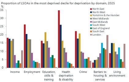
For example, although London is comfortably the most deprived in terms of barriers to housing and services, the relative pattern of deprivation has shifted. The inclusion of travel times and broadband speeds might help explain why London is not the negative outlier it once was, and why the South West has considerably closed the gap. New indicators for noise pollution and access to private outdoor space could also explain London’s worsening performance in terms of the living environment domain. On the flip side, London has seen the largest relative improvement in deprivation in the crime domain.
Chart 2: Northern regions perform poorly across most domains of deprivation
Source: Oxford Economics, MHCLG
But the picture across most metrics is largely unchanged. The North and the Midlands fare the worst across the employment, education, and income domains. Both the North East and the North West also have the highest levels of health deprivation, with the former performing relatively worse than in 2019. The North scores poorly on most metrics, only outperforming the South in the barriers to housing and services domain.
This North-South divide is neither new nor surprising. Despite the changes outlined above, the gap remains more or less where it was in 2019. We recently highlighted our expectation that economies in the South of England will continue to outperform their northern counterparts over the next few years, and that prospects for any new regional funding in the upcoming Budget are low. This provides little reason for optimism that the divide will close in the coming years.
There’s also the risk that the methodological changes may actually entrench economic disparities, given the worsening performance of London’s neighbourhoods, and the role this index plays in influencing where money is spent. MPs will be reflecting on the political repercussions of increasing spend in areas of London, which already receive significantly higher spend per head in many core services, at the expense of much lower income areas elsewhere—an issue already in the spotlight given the South-centric nature of the government’s recent infrastructure announcements on Heathrow, Gatwick, and Lower Thames Crossing.
Our forecasts indicate that European house prices are likely to continue rising strongly, leaving policymakers with little room to avoid action. The UK’s upcoming Budget and the EU’s Affordable Housing Plan will shed some light on how governments intend to respond, but policymakers underestimate the scale of the challenge at their peril.
Tags:
Related Insights

How can demographic trends inform local investment needs and priorities?
Over the past decade, the UK population has continued to grow steadily, recording stronger growth rates than many European peer nations. This has largely been driven by the continued growth in international migration.
Find Out More
Tight BoE vote to cut casts doubt on the path for rates
We still expect the Bank of England to cut Bank Rate by 25bps again in November, despite August's unexpectedly tight vote and the Monetary Policy Committee raising its inflation forecasts. However, our call is made with much less confidence than before.
Find Out More
What is driving European cities’ housing affordability challenge?
Housing affordability has emerged as a central challenge across Europe, particularly in major cities and tourist hotspots
Find Out More
IFRS 9 and the BCST: How the Bank of England’s Latest Stress Test Measures Economic Shocks
The Bank of England’s new BCST stress test introduces a recalibrated approach to measuring financial resilience in reflecting IFRS 9 impacts and a softer, more realistic stress pathway. What does this mean for lenders and the wider economy? Discover how Oxford Economics extends the BoE’s guidance into a global scenario to help businesses stay prepared for the next downturn.
Find Out More